I often run into deliberate distortions of reality through design — in startup pitch decks, and in infographics in general. Here's a part of my collection.
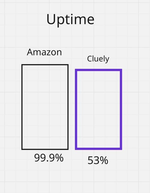
1. Distort the proportions
Here we see that the servers of startup Cluely work almost as well as Amazon's servers. Until you read the caption. They run 53% of the time, no less. The designer distorted the proportions heavily.
2. Play with the axes
Here is another chart. It's obvious to everyone that with a good project manager (PM) there is less chaos on a project. Until you look at the values on the Y axis.
It's a joke, of course, but it trains your "pattern-recognition eye" well.
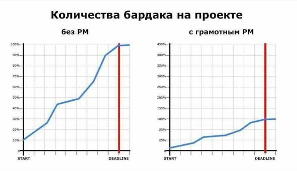
Designers call this "playing with the axes" — stretching or, on the contrary, squashing them. A common technique. No false information, just sleight of hand. The inattentive investor might not read the small captions.
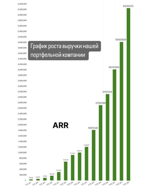
3. Show a forecast, not a fact
Here is a trickier example. A pretty "hockey stick"? I've seen hundreds. What's the catch? First, this is not quarterly revenue (as it seems at first glance). This is ARR (annual recurring revenue). Quarterly revenue could have been $6M ($1M in January, $2M in February, $3M in March).
Second, it's calculated as aggressively as possible. How do you compute (not yet earned) annual revenue? Either as $6M × 4 quarters = $24M, or by the best month, which distorts the picture even more. Most often founders take $3M (March's revenue) and multiply by 12 months = $36M. Naturally, if subsequent months are worse than March, March will continue to serve as the basis — no point letting it go to waste.
You can also show accumulated revenue (everything earned since Adam) instead of strictly the period in question. And, of course, squash the axes so the bars visually shoot upward. The same chart by month would most likely look SAD.
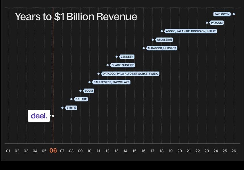
4. Exclude everything inconvenient from the sample
And here's a challenge problem. What's wrong with this chart? Compared to the previous one, this is child's play. Where are we being lied to?
In this case, only payment companies are included in the analysis (and I suspect not even all of them). The other 95% of companies are excluded. Even our Groupon, in 2010, hit $1B revenue much faster. Today growth is easier because (a) there are more users on the internet (both individuals and businesses), and (b) every 15 years, due to inflation, the dollar becomes roughly 2x cheaper.
The second thing to check is whether this is revenue or gross transaction volume. Payment services and exchanges find it easy to show all the money flowing through them as their revenue. That's not correct — the money belongs to others. The platform's revenue is 1.5–2% of all funds (various commissions).
Where is the ethical line?
I think the maximum permissible move is to accentuate real metrics. The numbers themselves are correct, the captions are correct, but for better demonstration of a thesis (one actually observed in nature, not made up) the visual is slightly emphasized.
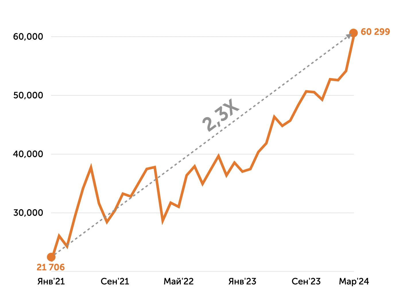
Below is an example. In the first version of the chart from the designer, the metric's growth was almost invisible — The Sorrows of Horizontal Werther of some kind.
Designer made those edits: (a) start the Y axis not at zero but at 20,000 (the axis is correctly labeled, so there's no deception); (b) start with January (one of the lowest points) and end on the highest point; (c) add a gray trend line with the labeled CAGR (growth rate).
This approach is fine because the metric did grow in reality.
Bottom line: these tricks don't work on professional investors and immediately raise a red flag. But training your "pattern-recognition eye" for such techniques is very useful (and entertaining).